-
Architects: Within-Beyond Studio
- Area: 400 m²
- Year: 2018
-
Photographs:Wu Tou
-
Manufacturers: Han Meier Resin Ground, LMFU Office Furniture, Pengdayinuo Metal Mesh
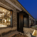
Text description provided by the architects. The project is located in Hengtong Business park, Beijing. The original building is an old factory warehouse with steel structure, 400 sqm area and 4.2m floor height.

STYLE
The client — WMY is a young advertising agency, standing at a leading place in this industry with its outstanding creation and strong power on implement and supervising. This company is in great need of a bigger and proper space to work. The client`s requirement for workplace is that they need a space highly suitable for its enterprise spirit — creative, independent and open minded.

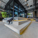
When stepping into the factory during the site survey, designer found client`s black motor bike parking in the space which live in perfect harmony with the naked concrete wall and steel beams and the designer came up with a mind that the aim of this project is to provide a space containing the original site spirit and let the client`s life style, which has some inner coherence with the raw material of the factory continues in the space. As a result of which, the theme of this space supposed to be industrial style.

MATERIAL
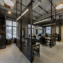
In respect of the original spirit of the factory warehouse, the designer chose the concrete and metal as the major interior material. The material of the floor and wall finish is cement paint with raw concrete texture which shaped a basic industrial atmosphere. The ceiling and partition wall besides the working station is made of black metal mesh in the purpose of maintain the space transparency and sense of sequence and ceremony. The material of customized furniture made of cement panel and black steel remains the same taste with the whole theme.

SPACE
In order to make full use of the space`s characteristic, we inputted several featured node in certain place in the office.


When in closed mode, the rotatable concrete screen in front the entrance lobby serves as partition wall between the lobby and pantry as well as background screen for the client`s mascot motor bike. When in opened mode, the lobby and pantry connected together served as a whole big space for party.


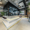
We lifted the big meeting room onto a seat like stepping so as to create a focal point in the first station of this journey. The stepping can be worked as part of the seminar space. In the meantime, the stepping extended into the pantry and served as its seat, which create a space continuity in public space.

The main circulation space set beside both sides of the lobby possess different space experience, the one close to the exterior wall, with seminar space aside, shares plenty daylight through the French window, and the one in the middle of the space serves as exhibition space surrounded by carved concrete culture wall and featured lights.


